Ciphon Style Guide
A snapshot-based guide for the current Ciphon web app. The examples below are derived from Chrome captures of the local app and from the Vue, Tailwind, and PrimeVue theme sources.
Design Principles
Dense and operational
Use compact tables, restrained spacing, and short labels. Most workflows are repeated accounting tasks, so scanning and comparison matter more than decorative layout.
Blue as action and location
Reserve strong blue for primary actions, active navigation, focused controls, and selected states. Supporting states should use quiet tinted tags.
Surfaces stay flat
Use white panels on a light gray app ground. Prefer thin borders over heavy shadows. Shadows are mainly for dialogs and overlays.
Color Palette
Typography and Rhythm
Font stack
Roboto is loaded locally at 400, 500, and 700 weights. Fallbacks are Helvetica Neue, Helvetica, Arial, and Lucida Grande.
Base scale
The app uses a 14px html root, then tightens body text to roughly 11.3px in rendered Chrome. PrimeVue controls inherit this compact scale.
Label style
Navigation and section labels use uppercase, 10 to 11px text, 700 weight, and wider letter spacing for fast scanning.
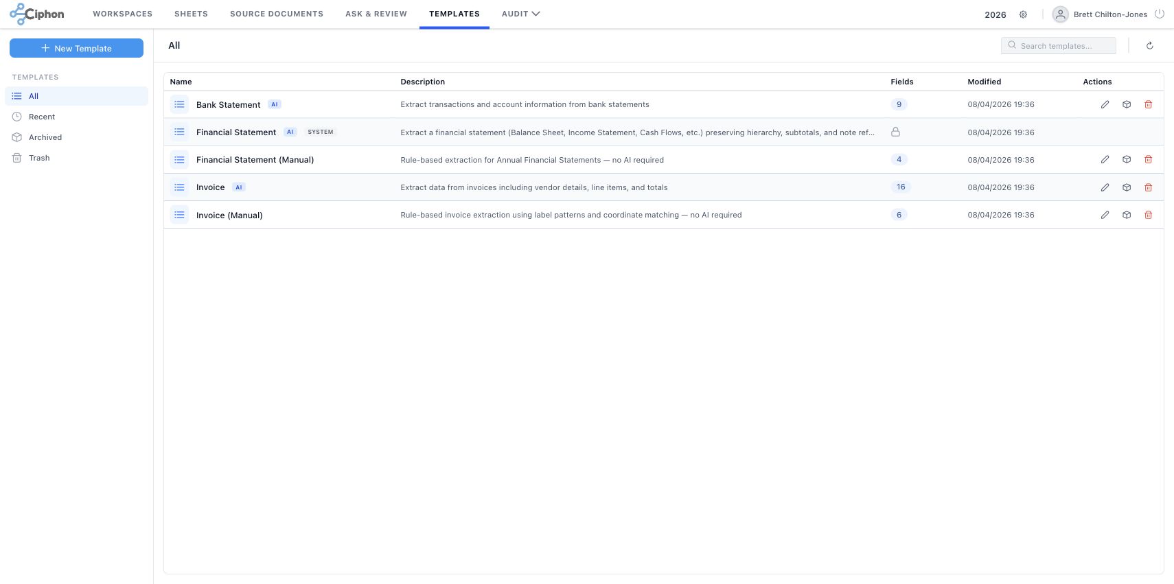
Core UI Elements
Buttons
PrimeVue buttons are normalized to 32px height. Primary actions usually sit in the left sidebar or top-right toolbar.
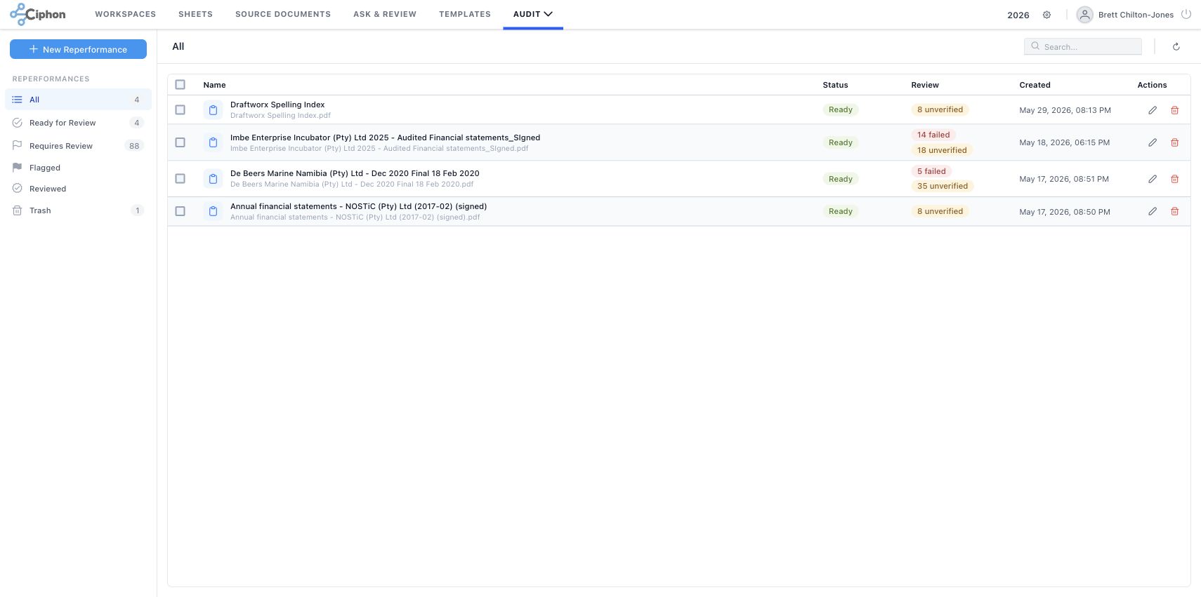
Tags and statuses
Tags use 10px text, pill radius, low-saturation backgrounds, and semantic foreground colors.
Inputs
Inputs are 32px high. PrimeVue Select and Dropdown controls render slightly tighter at 30px with a white surface, compact label padding, and a separate trigger area.
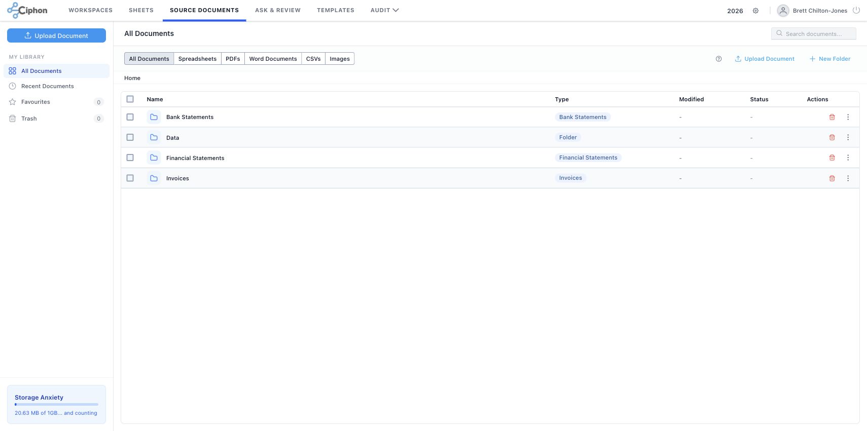
Tables
| Name | Status | Modified | Actions |
|---|---|---|---|
| Financial Statements | Folder | 30/05/2026 06:23 | ... |
| Draftworx Spelling Index | Ready | May 29, 2026 | ... |
Rows are low-height and separated by thin borders. Action columns favor icons over text.
Functional Visual Language
Tag severity colors
These are the shared PrimeVue tag meanings used across Source Documents, Compare, and Reperformance.
Review state colors
Review tags describe human judgement layered on top of automated results.
File type colors
Source document rows use icon color to communicate file family before the user reads the extension.
Source document statuses
| Status | Color | Meaning and usage |
|---|---|---|
pending |
pending | The document is known to the system but extraction or processing has not started yet. |
processing |
processing | The worker is extracting or converting the file. Use info blue because the state is active but not a problem. |
completed |
completed | Extraction or processing finished successfully and the document can be used for downstream workflows. |
error |
error | Processing failed. The row tooltip explains that there was an error processing the file. |
| none | - | Folders or files without processing metadata show a dash rather than a colored status. |
Compare statuses and colors
| Status or change | Color | Meaning and usage |
|---|---|---|
created | Created | Comparison record exists, but results are not ready. |
comparing | In Progress | Comparison is running. The list may append a percentage when available. |
ready | Ready | Automated comparison has completed and is ready for review. |
reviewed | Reviewed | The comparison or individual differences have been reviewed. |
flagged | Flagged | A reviewer marked the comparison or difference as needing attention. |
error | Error | Comparison failed. |
unchanged | Unchanged | Content matched between documents. It contributes to summary counts and uses green success styling when shown. |
modified | Modified | Text changed between documents. Difference cards use orange; PDF highlights use orange changed marks. |
added | Added | Content appears only in the revised document. Difference cards, tags, and PDF highlights use blue. |
deleted | Deleted | Content appears only in the original document. Cards and PDF deletion highlights use red. |
moved | Moved | Content is substantially the same but appears in a different location. Cards use slate and the tag stays secondary. |
Reperformance statuses and colors
| Status or check | Color | Meaning and usage |
|---|---|---|
created | Created | Reperformance record exists but no completed extraction/check result is ready yet. |
extracting | In Progress | The document is being extracted or checks are being refreshed. A percentage can be shown. |
ready | Ready | Extraction and checks are available for review. |
reviewed | Reviewed | Document-level or check-level review is complete. |
flagged | Flagged | Document-level or check-level item has been flagged by a reviewer. |
error | Error | Extraction or checks failed. |
pass | pass | Automated check passed. Tables use green cell highlights and PDF overlays use green markers. |
error | error | Automated check failed. Tables use red cell highlights and PDF overlays use red markers. |
warning | warning | Check needs attention but is not treated as a hard failure. Tables and PDF overlays use amber markers. |
info | info | Unverified check. Amber communicates review needed without implying a failed assertion. |
Page Structure
Audit UI Patterns
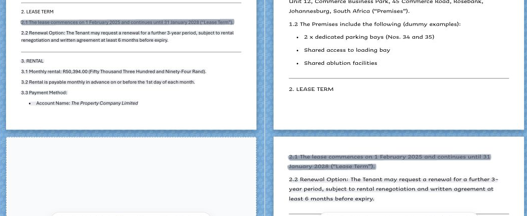
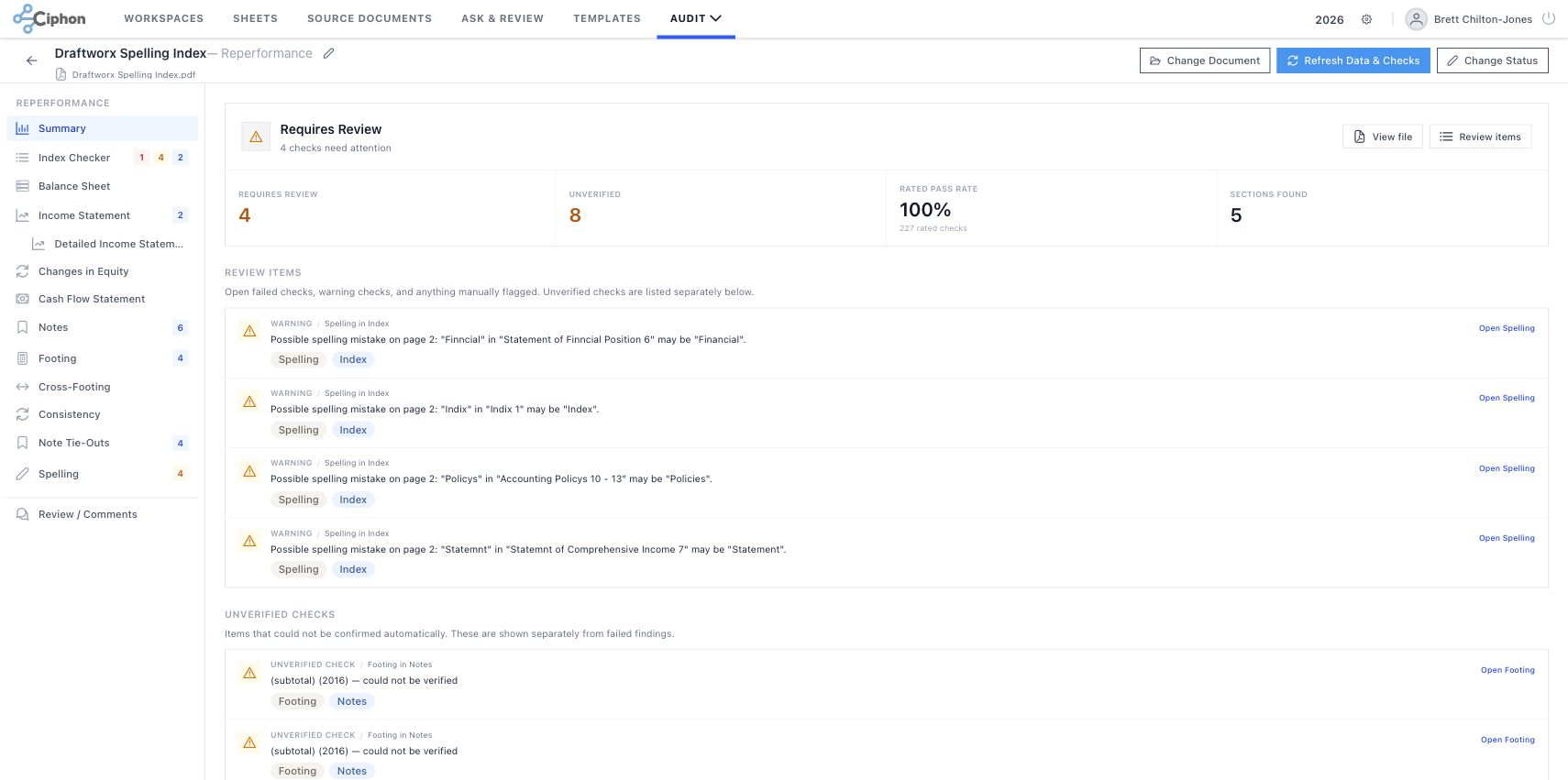
Possible spelling mistake on page 2. Audit findings are rendered as stacked, full-width review rows with small tags.
PDF Review Patterns
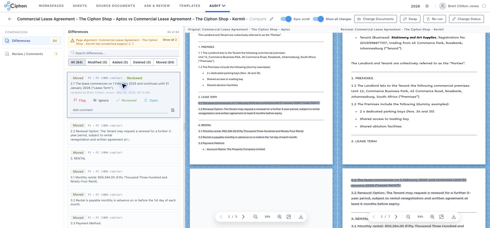
Comparison PDFs
Comparison detail uses a left review panel, a draggable split, and two synchronized PDF canvases. The toolbar exposes Sync scroll and Show all changes switches. Difference cards drive both PDFs, and persistent text highlights remain visible while reviewing.
Reperformance PDFs
Reperformance detail uses a left checker or statement panel and a single right PDF canvas. Overlay highlights are severity-aware, PDF clicks sync back into the left panel, and print/download can include review highlights.

Linked review list
Selected review rows use tinted backgrounds, thin borders, and compact action buttons.
Financial checks and differences share the same operational review rhythm.
Dialogs and Overlays
Settings
Chrome Screenshot Set


Additional captures are stored in the screenshots folder for the Ask loading variation and profile dialog. The profile capture is not embedded here because it displays test account identity.
Implementation Sources
apps/frontend/src/main.tsdefines the PrimeVue Material preset and maps the primary scale to blue.apps/frontend/src/assets/tailwind.cssnormalizes control density, tag colors, table spacing, and SpreadJS font scale.apps/frontend/src/assets/styles.scssdefines audit highlights, diff styling, drop zones, and PDF overlays.apps/frontend/src/layout/AppTopbar.vuedefines the rendered top navigation and active-tab treatment.apps/frontend/src/components/FileExplorer/FileExplorer.vuerenders Source Document processing statuses and maps pending, processing, completed, and error to tag severities.apps/frontend/src/components/FileExplorer/fileIcons.tsmaps file families to PDF, Word, spreadsheet, image, archive, data, and folder icon colors.apps/frontend/src/types/comparison.tsdefines Compare document statuses, change types, labels, and tag severities.apps/frontend/src/types/reperformance.tsdefines Reperformance document statuses, check severities, review states, labels, and tag severities.apps/frontend/src/components/comparison/DualPdfPanel.vueimplements synchronized dual-PDF comparison review, floating controls, and persistent change highlights.apps/frontend/src/components/CanvasPdfViewer.vuedraws the comparison PDF marker palette for modified, added, deleted, moved, selected, and persistent highlights.apps/frontend/src/components/reperformance/detail/PdfPanel.vueimplements the single-PDF reperformance panel, severity overlays, PDF click navigation, and annotated print/download actions.apps/frontend/src/components/reperformance/CanvasPdfViewer.vuedraws the marker-style severity overlays used by the reperformance PDF panel.docs/style-guide/chrome-style-snapshot.jsonstores sampled Chrome computed styles from the workspaces view.